The hidden meaning of color can be used as a powerful tool in art.
Once the simple principles of color are understood the artist can use color to enchant the viewer.
In fact, research shows that hidden meaning of color can play a major role in our overall state of well-being. The colors we surround ourselves with directly influence the way we feel and relax. Color allows us to create our own individuality and flare. For years interior decorators, graphic designers, advertisers and artists have been using color to enhance our environments.
Color can be used to evoke a certain mood or to create a message or sharp response in the viewer. As artists we learn how to use the positive or negative attributes of color in our works to subliminally send a message.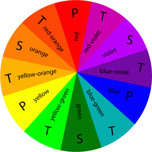
The following examples illustrate how people react differently to cool and warm colors.
Cool colors
- Based on blue undertones and bring to mind a calming effect.
- These colors range from cold icy blues to warm and nurturing Mediterranean turquoises.
- Many decorators use these colors in spas, bathrooms and other quiet environments.
- Blues lower heart rate and reduces appetite.
- Blue represents dependability.
- It is commonly worn in uniforms and business suits.
- Dark blue is generally used by more authoritative figures including police officers and our Presidents!
- Blue and greens are used in advertising medicines and health care products.
- ‘Greenrooms’ of theaters are so called because their green walls are often used to steady the nerves of actors.
- Dark greens do well in offices and studies.
- Greens are commonly used for outdoor products.
Warm colors
- Based on yellow undertones and tend to convey emotions ranging from happiness to violence.
- Red, orange and yellow colors trigger hunger.
- This is why you see restaurants like McDonalds, Wendy’s and Burger King using these colors in their logos and advertising.
- Safeway, Walgreens and Costco all use red in their logos.
- Red instantly attracts, makes people excited and increases the heart rate.
- Just think of Coke and Red Bull!
Before I share the hidden meaning of each color in the spectrum, first a brief Color Theory history lesson:
- Philosopher, Leone Battista Alberti (c. 1435) and artist/inventor, Leonardo da Vinci (c. 1495) were the first known writings on color principles.
- In 1666, Isaac Newton’s Theory of Color and primary colors were introduced.
- Just over a hundred years after Newton’s discovery, Moses Harris created the first color wheel. It classified red, blue and yellow as the three primary colors. Primary colors cannot be created by mixing any other colors together.
- Then in the early twentieth century, German painter, Johannes Itten extended the color wheel to include secondary and tertiary colors. He also pioneered the idea of warm and cool colors and principle that any shade of color can either have a warm base or a cool base.
Itten’s ground-breaking Color Star Chart featured twelve colors…

THREE PRIMARY COLORS:
- RED
- YELLOW
- BLUE
THREE SECONDARY COLORS: made by mixing the primary colors together
- RED + YELLOW =ORANGE
- YELLOW + BLUE = GREEN
- RED + BLUE = PURPLE
SIX TERTIARY: made by mixing a primary and a secondary color together
TINTS & SHADES: Any color can be lightened by adding white, known as a tint. The same color can be darkened by adding black, known as a shade. Shades of white being more feminine and tints of black become more masculine
COMPLEMENTARY & COLOR HARMONY: Complementary colors have a strong visual impact when placed alongside another. Complementary colors are directly opposite each other on the color wheel.
- RED + GREEN
- BLUE + ORANGE
- YELLOW + PURPLE
Harmonious colors rest alongside each other in the color wheel.
Hint: Experiment with crayons to explore the relationship of different colors to each other and discover which combination appeals to you.
- YELLOW + ORANGE = harmony
- BLUE + PURPLE = harmony
THE MEANING OF COLOR:
RED: The color of assertion, strength, romance, excitement, vitality, physical power, outgoing, ambitious and impulsive. It is a color that flatters the skin and can make an excellent background. Pale pink are warm and peaceful and combine well with greens. The deeper reds create an atmosphere of retrained opulence and power. Red elicits an uncomplicated nature with a zest for life. But, red can also connote danger or threats. Fire engines, stop signs and traffic lights are a perfect example.
ORANGE: Midway between red and orange it is a cheerful color. It is a flamboyant and lively color. Orange can be assertive, dynamic, and spontaneous and signifies youth and fearlessness. Orange stimulates the brain and produces oxygen and mental activity. Dark-orange signifies deceit or distrust, whereas red-orange can correspond to aggression, domination and thirst for action.
YELLOW: We associate yellow with sunshine and it represents light. It creates a feeling of hope, happiness and wisdom. The color evokes an optimistic sense of well being and natural light. It is airy, radiant and atmospheric. Yellow gives the feeling that all is okay with the world. An example of this is Luminism, an early generation of landscape painters who explored ways to depict light realistically on canvas by using color to depict a melodramatic or romantic mood. But, yellow is a complicated color. On one hand, it is considered ‘light-hearted’ and childlike, but actually it is known to make babies cry.
Although, light-yellow represents intellect, freshness and joy, dull-yellow is associated with caution, decay, sickness and jealousy. Yellow at times is cowardice. The phrase, ‘yellow-bellied-coward” came into use around 1910 which probably derives from yellow’s association with both treason and weakness. More than a millennium ago, Judas Iscariot was often portrayed in yellow garb symbolizing his betrayal of Jesus Christ – a cowardly act.
In America’s pioneer days, yellow dogs were considered worthless and the term “yellow dog” came to be used to describe anything worthless. Our observation of the yellow of tree leaves as they age and die, as well as the yellowing of old books and papers, led to the association of yellow with old age and illness.
But, yellow is very effective at attracting attention – think of a taxi cab. Yellow is also used as a warning symbol. In football, a ‘yellow flag’ issues a warning. When place alongside black, yellow issues a warning. Yellow is also used in traffic lights and signs to advice us of danger.
The list goes on and on…
Hint: When painting light use warm and cool colors against each other, not black to white
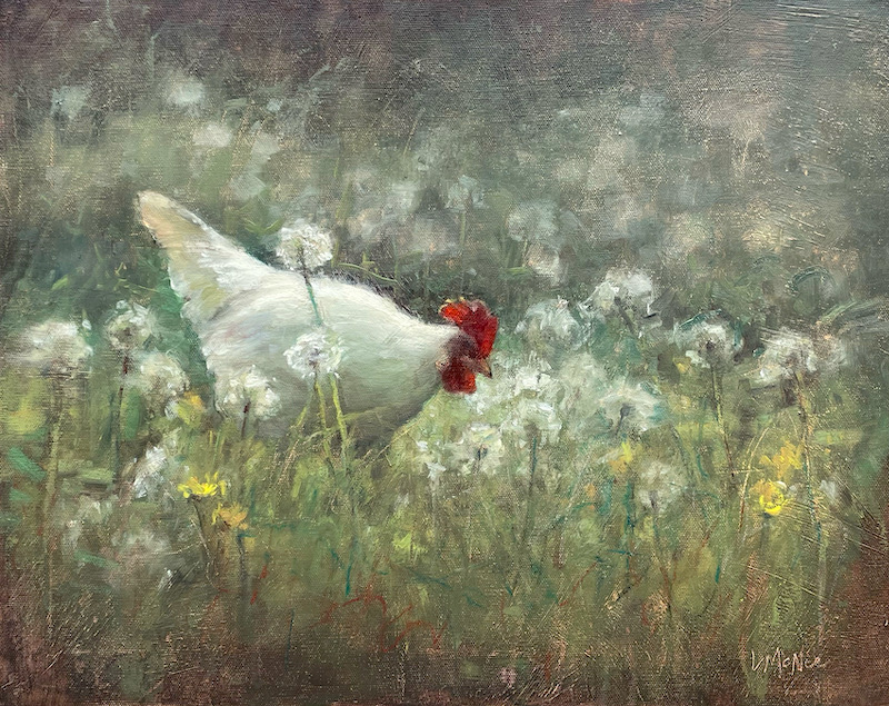
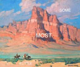
The above painting has a calm, harmonious feeling. This serene environment was created by using light-yellows and varied greens along with dashes of complimentary colors.
GREEN: The color of harmony, balance and security. Green also has a calming effect and symbolic meaning of hope, peace, gentleness and modesty. It is soothing, refined and civilized with great healing power. Green suggests stability and endurance, hope and growth.
It sometimes denotes lack of experience, for example a ‘green-horn’ is a novice. Pale greens are particularly restful. Dark greens remind us of money, banking and Wall Street. However, at times yellow-green is used to portray sickness, discord and jealousy. Remember the phrase, “green with envy”???
BLUE: The color of the sea and sky, it has a quality of cool expansiveness and openness. Soft, soothing, compassionate and caring, blue is an introspective color. Blue is often a formal color which represents wisdom and steady character. Many superheroes wear blue! It is considered a masculine color and the choice of corporate America.
But, the quiet character and poetic subtlety of blue can also be associated with melancholy and resignation. Remember Pablo Picasso’s infamous “Blue Period” of art? Picasso’s personal trauma found expression in a series of deeply sentimental paintings which comprise his “Blue Period”. I even dedicated a helpful post to artists who find themselves Feeling Blue…
PURPLE: A combination of red and blue, purples are regal and dignified to be used with discretion. Pale shades are restful and serene, but the darker shades make it difficult to focus. Lavenders signify refined things of life, creative, witty and civilized.
Purples can be tiring on the eyes and cause a sense of frustration, but it can make an excellent foil for works of art. Gloom and sad feelings can be portrayed by using purples.
BROWN: The color of living wood and the earth. Rich, subtle and extraordinarily restful to look upon, brown creates a feeling of coolness and warmth at the same time. It combines well with rich colors such as purple and gold (popular in the Victorian era). It is a steady, dependable, conservative, conscientious and reliable color.
Brown evokes a sense of nostalgia and reminds us of the great works of Rembrandt, Titian and Rubens. Tonalism used rich earth tones and muted colors to create moody landscapes. Van Gogh’s used a lot of brown to set a somber and depressed mood in the famous painting The Potato Eaters . Think back on Soviet Russia and you might remember the common people usually wore shades of brown.
GRAY: This color represents caution and compromise. Many beautiful grays can be made by mixing complimentary colors together. Grays give a sense of peace to the viewer.
WHITE: Symbolic of safety, cleanliness and purity. White emanates youth, perfection and innocence. Angels are usually thought of as white. White is simplicity and freshness, but too much can give a clinical feeling. Doctors, hospitals and sterility are associated the white.
Low fat foods and dairy products use white in their packaging. But, in many Eastern cultures, white signifies death, mourning, funerals and unhappiness. Ghosts are white and giving white flowers to the sick is bad luck in many cultures. In painting, use white sparingly. It can make colors chalky and lifeless.

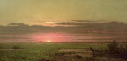
“On Edge” ©Lori McNee
The intensity and energy in the painting above was created by using variations of the colors, black and white. The opposite symbology and meaning of each color strikes a hidden message and restlessness in the viewer.
BLACK: Mysterious and hidden, black can have a morbid feeling. It gives us a feeling of the unknown and negative connotations like, black-hole, blacklist, black-humor or black-death. In most Western cultures, black is the symbol of grief. However, black can be dignified and showy with sophistication. Black will also punctuate color schemes that rely on strong contrasting colors. Try mixing your own blacks, rather than using it straight from the tube.

“A Second Glance” ©Lori McNee
In this painting I wanted to create a mysterious mood. Using black and dark greens helped achieve my goal. I rarely use black from the tube. I can mix a great ‘black’ with Ultra Marine Blue & Cadmium Orange or Burnt Umber. Check out my Cobra Oil Paint palette by Royal Talens!
Most successful artists know how to use the meaning of color to their advantage, but many aspiring and novice artists are not aware of the power of color on the viewer.
This article is NOT my abbreviated attempt at teaching ‘Color Theory’. Volumes of books on the subject could fill any room! But, my intention is to share a thought provoking overview on the color spectrum and its meaning. Artists are always looking for ways to create meaning in their work.
Now with a better understanding of color, I hope you can enhance your paintings with the appropriate subliminal message or meaning to capture the mood you desire to portray.
You might like to read:
Improve Color Harmony – Use Yin Yang in Painting
The Importance of Value & Tone in Painting
The Hidden Meaning of the Color Red
The Color Blue – Use the Hidden Meaning
The Color Yellow – Use its Hidden Meaning
The Color Green – How to Use its Hidden Meaning in Art and Design
Very helpful. Thank you for sharing!
Hi Doroteja-
Thanks for taking time to comment. Hope to see you again!
this is great . the way u express the color is speechless. if u have more idea plz inform me
thanks for this information
Awesome post. Makes me want to bring my camera and take pictures on every trip into the outdoors. Both your painting and editorial content is the “Best of the Best”
Congrats!
Chris
Great info! I will refer to this often, so much of what we envision to create often comes naturally, but it always helps to remember and be reminded of the principles upon which we build our works of art.
Thanks so much!
Glad you liked this post. There is so much to remember as artists! 🙂
Very good article. I try to evoke calm and peacefulness in my paintings and have always been partial to blues, and violets. I still have some trouble mixing my greens and do much better mixing them blue green rather than with lots of yellow. Thanks for your posts.
I think greens are the most personal colors for artists to mix. Green is a very subjective color. Interesting. 🙂
Wonderful! – especially about the psychology of color.
I’m going to be kind of pedantic about the technical part, though – I always have to tell my multimedia students that their art teacher lied to them about red, yellow and blue!
You may well already know this – I have a notion that everyone should, who works with color.
For light *emitters* such as a computer monitor, the primary colors are red, *green* and blue. Mixed in the right proportions, these add up to white. (You’re combining colors of light, not paint.)
For light *absorbers* such as paint, ink or print toner, the primary colors are magenta, yellow and cyan (light greenish blue). These are what printers use. Close to red, yellow and blue, but not identical – I remember once (before I knew this stuff) getting horrifically frustrated trying to make green by mixing yellow with (I think Prussian) blue, and the green was SO muddy.
I do think you’re spot on about what different colors *do*, allowing for occasional individual differences. Thank you!
Thanks for the interesting additions to the article on color. I orginally thought about adding some of this information, especially about magenta, yellow and cyan (which we all know makes black when mixed together) but, I chose to speak primarily to the studio artist. Although, I didn’t know about the primary colors for a computer monitor! Artists’ pigments are limited in their abilities to create light, but great artists have amazing results. Thanks for your comment. Lori
I don’t object to the points made but if the definition of a primary colour is a colour that cannot be mixed from other colours then magenta and cyan cannot really be considered primary colours since they are the result of combining two other colours – red+blue and blue+green respectively. However, different industries (painting, printing, photography) adopt different uses of colour and thus create primaries that suit their needs. Yellow, magenta and cyan may are called primaries for the colour printing industry (and photography when colour printing using light) because these colours allow for better colour reproduction using printing inks. However, I believe it would be confusing for artists mixing paint media to have various different sets of primaries and red, yellow, and blue work better in paint media. I don’t think art teachers have lied to students about the primary colours since they have taught their students the correct system for paint media. However, it would be incorrect to teach printing industry students the paint primaries and I’m sure this isn’t done. Just my tuppence worth.
Hi Les, thanks for sharing your knowledge on color with us. I agree with your comments and appreciate them. My post is a quick overview of an extremely complex subject. Thanks for clarifying differences between the primary colors for printing and for painting…
Very nice article of course, so thank you as a true beginner looking for all available advice!
You are welcome Mik!
There are no primary colours. It’s called colour bias theory… Otherwise two primaries would exactly cancel each other and return black… Thus we officially ‘grey’ a colour each time we mix and I think the books when talking about primary colours say the three primary colours give a type of brown.
So, for instance, two so called primary colours with the same bias( say, towards orange) will produce a bright orange but if they are not both biased toward orange they will produce some kind of dull orange ,… Or perhaps even mud… Yet because this mud is a type of grey and greys are the complement to colour itself it could make the whole thing work!
Um, yeh- any questions ;^}’///,<
Hello again Mik, thanks so much for sharing your added color tips here. I do my best to help, but I am always learning myself. Very interesting topic…
Good article but I have a question.
Where are the negative color connotations?
Every color has a dark side.
Red can also mean danger/threats.
Why do you think stop signs and stop lights are red?
Green can also mean sickness.
Green eggs and ham other than in a Dr Seuss world or covered with mint jelly or food coloring is usually bad news.
Black is the color of death in Western cultures while white is the color of death in Eastern colors.
Its important that artists know the good and the bad connotations of colors.
Thanks for sharing your thoughts on color. I must have been in an extra ‘cheery’ mood when I wrote this post…obviously, there are negative connotations with certain colors and the knowledge of it can help the artist deliver a message. I added some dark meanings… thanks, Lori
I am the executive director of a non profit organization that teaches art and sells art for disabled people. We are in the process of re-painting the walls in our gallery. THe previous color was a shade of burnt orange. I loved the color and chose it for the energy it provided when you walked in the room. One member of the staff wants to paint the walls a off white so the pictures stand out. I agree that the off white might achieve that outcome but I feel the overall feeling of excitment and engergy will be lost. Any suggestions would be appreciated. You can see our gallery on our web page. Thanks!
Hi Terry, what a wonderful organization. I enjoyed looking at your website. Burnt orange is a member of the ‘earth’ palette family which echoes the natural world. The earth palette is warm and inviting especially for living rooms, studies, dining rooms and corridors. Colors from this family create an atmosphere of solid well-being, stability and purpose. Maybe a new coat of muted Terracotta or Terraverde will do the trick. I would steer away from it being too bright or intense of an orange that would distract from the art. Off-white might feel too clinical which could cause a feeling that is cold and not comforting. Also, muted green walls work well for galleries. Green creates a safe and nurturing, but lively backdrop to art. Let me know what you decide. Good luck – Lori 🙂
Grey is the complement to colour, so off white should work I imagine!
I agree!
This is some of the best information on color I have found. I just started teaching workshops on hand-coloring photographs. Since my training is in black and white photography, much of my work with color was instinctual which made it more difficult to teach.
This information will help me become a better hand-color artist and teacher. Thank you!
Wow, Dianne! Thanks for taking time to write such a glowing comment. I am glad you found the information helpful. It was a fun post to research and share with my readers. I learned a lot too and am happy to hear it is helping others. I would love to see your creative results. Good luck and keep in touch. Thanks, Lori 🙂
Well, I mix colour every day, and I found this a very interesting and useful post. Often my mixes are ‘one of a kind’. I’ll have to think about whether I’m influenced by the colour I’m mixing – or whether the colour I’m mixing is influenced by my initial mood. Lots to think about there…
Thanks for sharing a very insightful introduction to colour Lori. I found it really interesting that my current series of paintings instinctively follow the psychological readings outlined here.
I’m sure this article will help many artists, so good job!
River.
Hi River- I am just now responding to last month’s comments! I am glad you like the post on color. I really enjoyed sharing it with my readers and hope you refer back to it when needed. Thanks, Lori
Brilliant article most informative and quite enlightening! R e s p e c t!
Imam, thanks for the very nice comment. I am glad you found this post as interesting as I do! Using color has really helped me in my paintings. I look forward to seeing you again.
Best-
Lori
Hi,
I was looking for the meaning of colors to help me create a website. I enjoyed your post very much. Thank you.
Hello Ed. Thanks for letting me know this post helped you. What colors did you decide to use? Send me a link someday…
Lori 🙂
Great meanings for the colors, it helped me a lot on one of my school projects.
I feel like going back an analyzing all my art work . I will start to think more about the colors I use. Thanks for the information Lori.
Hi Luther-
Isn’t this all fascinating? It has really helped me create some interesting paintings. Let me know how it all goes for you!
Best-
lori
As a beginner it will be very much useful for me. Thanks a lot. Can I have a look at your works? Can you please send the link to your portfolios?
Hello Rajeev –
I am glad these articles are helpful to you. My art can be seen on my website, http://lorimcnee.com I hope you enjoy it all!
Happy creating-
Lori
Hello Lori you Lori McNee you, We are fb friends and I love viewing your beautiful post and work! Without going into why other than for reasons of a setback. I haven’t painted in a little over a year. And I very, rarely post any of my paintings because I have so many wonderful artist friends on fb that are so superior I am intimidated and to shy to post much. I’m finally starting to paint again!!! Hurrah! I was wondering if you could check out my recent painting I finally got the guts up to post. I was very surprised and pleased with how many comments I got. It was inspiring and encourgaing to say the least. I’m finally gotten past my painters block and ready to paint like never before. It’s good to feel this motivating and inspiring feeling again. It’s like I’ve come alive again. I appreciate your comments and time Lori! Thanks again my friend and God bless. Sincerely, David
Hello David, yes I recognize you…thanks for taking time to share your story here. I am so glad you are painting and enjoying FB. I have learned a lot from other artists there, it is a great networking hub of information.
See you soon!
Lori 🙂
Hi Lori,
Just artist surfing when I found this post. My paintings are quiet and peaceful, it’s so good to have a color guideline now.
Ellene
I am glad you found this post helpful and interesting. I will look at your work!
Best-
Lori
Hi Lori, I just found your website and I am enjoying reading your articles. I was wondering what you meant by “The opposite symbology and meaning of each color strikes a hidden message and restlessness in the viewer.” when referring to your painting “On Edge”. I struggle with interpreting artwork and also putting meaning into mine, so I found your comment interesting. Do you have any articles written on interpreting artwork and creating meaning in artwork or could you recommend any? Thank you! Nancy
Hi Lori – I really enjoyed your article on color – liked it on Facebook and posted it on Twitter. I officially started a 2-week vacation today and look forward to some painting time. Please let me know what you think about my painting “Soldier”. God bless you and your artwork! Julian Wayne Hagan – Nashville, TN
http://julian-wayne-hagan.artistwebsites.com/featured/soldier-julian-wayne-hagan.html
Hi Julian, thanks for your comment and for sharing your painting with me. The subject surprised me, because I was literally expecting to see a soldier. I love the yummy paint and palette. Reminds me of Van Gogh!
Best-
Lori
I really enjoyed reading your post and seeing your lovely artwork! I’m glad I stumbled on your blog. Thanks for your insights:)
Thank you for your comment Bonnie. I appreciate your visit,
Lori
Hello Lori:
I just saw your blog about this topic, and I recently did a Blog of this very subject on my web site about the Presence of Color, similar to this blog, because I felt it was important to know all about color,,,,its meanings and how color really does affect us, even our personalities. Also, eveto the point of different people being attracted to certain paintings due to colors because of their personalities.
I find this all very interesting and fascinating.
Thank you,
Sandy
Hello Sandy, yes color is fascinating. I have enjoyed learning about it and how to use it effectively in my own art.
Thanks for the comment and visit,
Lori
Outstanding article, this one’s a keeper as a refresher. Nice work!
So glad you liked this post!
Lori
Perhaps you could write next articles referring to this article. I want to read even more things about it! Excellent post. I was checking constantly this blog and I am impressed! Extremely useful information specifically the last part 🙂 charm beads beads for bracelet bracelet charms http://blog.sina.com.cn/s/blog_b391e7e10101cgh6.html
Great article! I love your blog:)
-Bonnie
Hey, thanks Bonnie. I truly appreciate the great feedback. 🙂
There is a ton of good info here. However, I’m hoping you can help me with a problem. There seems to be an issue that has developed over time regarding the definition of tertiary. You definition written out is correct. Tertiary = mixing two secondary colors together. But in the color wheel you posted you are showing the mixing of adjacent primary and secondary colors together, it my understand that these are intermediate colors by definition. You are not the only one!!! If you buy any color wheel from the color wheel company they have this incorrect definition too. The root of tertiary’s mean is three. Meaning that all three primary colors must be present which happens when you mix two secondary colors together. I’d love it I’d we would start discussing these tertiary colors for what they are = muted colors. They are beautiful and rich and we aren’t educating our new artists in this method because of this confusion. If love to get you on board with me! You interested???? Thanks for letting me post.
And keep sharing you stuff! You have a TON of great info here!
😉
Warmly,
Jes Gordon
Hello Jes, good points! I am way behind on comments, so thanks for your patience. This color ‘stuff’ is a complex subject that I was reluctant to write about it…thanks for adding your information. I would love to get on board with you…how? Let me know your thoughts. If you would like to share a guest post on this subject, I would welcome you with open arms. Best, Lori
wow thanks Lori but,how can you use those hidden meanings at the same time making it easier for paint watchers to quickly know what you meant?
You public will not necessarily know exactly what you mean. That is the mystery of a painting for each individual. However, there will be more depth and introspective meaning to the viewer…they will feel the subliminal message. I hope this helps. 🙂
😀 like colors all of colors have meaning..:D
😀 😀 :l :c
I found it so interesting too!
I”m 67 years young and only been oil painting 2 + years now, I have a hard time drawing ,because I can not draw. Is there hope for me ????? todd
Hello Todd, I love that you are painting at this stage in life. Creativng ‘art’ one of the only activities in which we can continue to improve at with age! So yes, keep at it and you will get better and better. Maybe take a class???
Really i love your article
Thank you so much!
very helpfull lori,thank you for posting such a colourfull topic,
Well, thank you Rashid. I do appreciate it 🙂
Your blogs are so intense if you read all your blogs you get a college art education. Color is a tool that is indispensable to an artist.
Hi Jason, wow that is a nice compliment for sure. I am so glad you are learning something from this blog…
Lori 🙂
Thanks Lori,
As a student teacher your site gave me some great insights into how colour is used in Art.
Cheers
Thank you Paul! Many apologies for the belated reply…
This is so Informative and mindful, thank you for such a great article.
Thank you! I hope it inspires you.
Thanks for the wonderful article on colours… really insightful…. gives me a perspective for my next paintings…. Cheers 🙂
Happy you enjoyed this post Bidisha. Thank you 🙂
Dis info is really useful…. I m a starter nd this info will b helping me ….
I’m so happy this helps you!
Nice article 🙂
Good one Lori! Excellant summary of color.
Hi Ed! I’m behind on comments, but it is so fun to see you here! I’m honored you enjoyed this. Hope all is well. Let’s catch up soon.